HelpSpace has grown a lot since the first customer. Many new features were added, but more importantly, many customers came on board.
![]()
old logo
The first logo was created with the idea of showing incoming and outgoing tickets in motion. It was developed on the fly to allow more time for development. For the new website, we decided to renew it and take the appropriate time to do so. After all, along with the name, the logo represents an essential part of our identity.
We sat together, and everyone wrote down what was important to them about the new logo for themselves. In the end, we took the result and put them next to each other. There is a lot of diversity among us, which for us is excellent and essential. So each of us has his view on things, and together we create a round thing from it. At least, most of the time. Now the results were not so that we could quickly put them together like puzzle pieces to create a picture. Here's an example: one wanted a round logo, the other wanted one with lots of corners.
Well, what is the logo designer for!? So we took the stuff and looked for a designer. On Dribbble we found Zahidul Islam, whose logos and illustration appealed to us. We really liked his ideas paired with the colors. We wrote to him and quickly agreed on the project terms.
We sent Zahidul our requirements. Since we have different opinions, we gave him the freedom to include his ideas, so maybe we could build a bridge. It didn't take long, and we had the first designs. They looked good. But we looked at ourselves - the logo is not us. There was no wow in us.
We wrote him feedback, adjusted our requirements, and waited for the new version. It was not long in coming. But again: we looked at ourselves - the logo was not us. The WOW was missing. We played the game at least three or four times until we realized that it didn't make sense that way. How can someone build a bridge if the foundation is not ready?

logo drafts
We let the knowledge sink in for a while and focused on our tasks: further developing the application, supporting the customers, and selling the software.
A little distance was good. John, who had been taking care of the communication with Zahidul, took his time and started sketching ideas on paper in the evenings. So one thing led to another. He showed the sketches to Stefan and Janis, who liked them directly - which was not a matter of course. They gave their feedback, the drawings were adapted and improved. Suddenly, it went very fast, and we had our basic shape for the logo.

sketch with the basic shape
We sent it to Zahidul, who finally had something we all liked. For him, it was now a piece of cake to refine it and make it shine in new colors. In no time, we had our new logo.
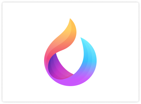
A logo with a substantial recognition value. A multifaceted ribbon that creates a space in a flowing movement, which offers protection and help on the inside.

the new HelpSpace logo
We are super happy and proud to have this awesome logo from within and meet all our requirements. 🥳


